Getting closer to the poster
Phoebe Cramer examines the beloved advertising medium at the heart of the Cambridge theatre scene

Theatre posters are a prominent feature of Cambridge’s scenery. Clustered on railings around every college and site going, they’re as natural as the gates of Trinity and the endless bicycle-lined streets. It’s almost sad how quickly posters blend into a typical background. Their presence is unchanging, yet every week it is a different collection of shows proudly displayed, switching as if by magic – or various producers running around with beady eyes and a fist full of cable ties.
A poster itself is a unique hybrid, too. It’s where advertising meets art; a combination of image, text and information that somehow has to convince people not only to spend their money, but also to invest time and interest into a story. Unlike film, theatre isn’t typically already photographic. Direct images of scenes can’t just be cut and edited. Instead, artwork has to be created of its own accord and somehow must convey a live performance. Here in Cambridge, publicity designers face an even harder challenge than professionals do. While some student actors are admittedly more recognisable than others, they’re not quite yet at the Benedict Cumberbatch level of their faces alone being enough for a poster. More creativity is required than that.
So what makes a theatre poster a good theatre poster? Stylistic appeal is, of course, subjective. Rick Poyner, Professor of Design and Visual Culture at the University of Reading, has openly declared that “there is no formula” to a perfect poster. What a theatre poster must “absolutely have to do is grab the viewer’s attention” and “magnetise the eye”. Magnetism. Sounds like an easy task.
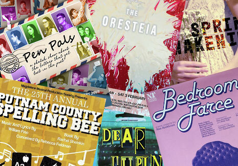
This week, as usual, lots of new posters have been competing for that magnetism around town. There’s a lively yellow 25th Annual Putnam County Spelling Bee (Henry Aldridge) and an intense looking Spring Awakening (Shali Reddy). The two ADC shows contrast enormously and yet both posters fulfil Poyner’s criteria by demanding attention. Rob Eager’s Footlights Presents: Pen Pals poster is bright, busy and actor-focused. It’s clearly comedy, even disregarding the Footlights stamp, but more than that you can tell it’s devised sketch instead of a comedic play simply by the overly-staged headshots that expand from their stamps.
In an entirely different vein, Oscar Yang’s striking design for The Oresteia, Aeschylus’s immense trilogy of Greek tragedies, is nothing if not defiant. By the use of a vivid red and title alone, the poster oozes an almost arrogant knowledge that the viewer will go to see this show. It gives nothing away but sets the tone no doubt perfectly. As Poyner says, “a theatre poster should make you want to find out more.” It hits this perfectly.
Poyner has been discussing the subject in relation to his current exhibition at the National Theatre called – directly enough –National Theatre Posters. It explores the designs and trends of the NT’s posters from 1963 to the present, presenting a rich history of art. There’s distinct trends with each new artistic director: Ken Briggs’ typography, a wave of Swiss modernism, the greyscale images with coloured text of Michael Mayhew, and Charlotte Wilkinson’s repeated focus on photography. Each shift mirrors a changing fashion and understanding of how best to communicate graphically.
A personal favourite of mine is the 1977 poster for Bedroom Farce (Richard Bird and Michael Mayhew). It is incredibly of its time, from the font to the grainy aura of the bed. It catches the eye with perfect colourings and a wonderful clash between the font and the plain suburban image. Just like Wang’s design, it’s a classic example of the principle that less is the way to intrigue.
It is a testament to the unbeatable integrity and clarity of the theatre poster that they have survived as a medium. Given the inescapable digital technology of the 21st century, posters could be seen as obsolete. Short videos are better suited to Facebook streams and Instagram, theatre trailers gaining popularity as more and more theatre gets recorded and distributed. A quick scroll through the infamous ‘Cambridge Theatre’ Facebook group and you come across just as many short trailers as posters. With music, moving visuals and dialogue snippets, the appeal of these new forms of publicity is hard to miss. In his book, Street Talk: The Rise and Fall of the Poster, Anghard Lewis notes that the phrase she hears most frequently when discussing posters with designers is that it is “a dead medium”.
Yet, while the field for theatre publicity has expanded remarkably both, professionally and within Cambridge, the poster is far from dead. The railings of St John’s Street would be remarkably bare without the overlapping masses of adverts and art. There’s no danger of the poster fading out, but it might still be worth pausing and appreciating them more
 News / Classics professor gave female student unconsensual ‘slobbery kiss’10 April 2026
 News / New Cambridgeshire train line could connect Bedford, Milton Keynes, Oxford, and Cambridge17 April 2026
 Interviews / Mental health and misinformation: psychiatry in the social media age with Dr Mei Simmons 13 April 2026
 News / Rowers fined nearly £4.5k for Lent Bumps misconduct9 April 2026
 Lifestyle / The blessings and curses of the uni house16 April 2026


