Roundup: a year in theatrical posters
From Shakespeare to George Orwell, Helen Brookes rounds up the best posters from this year in theatre
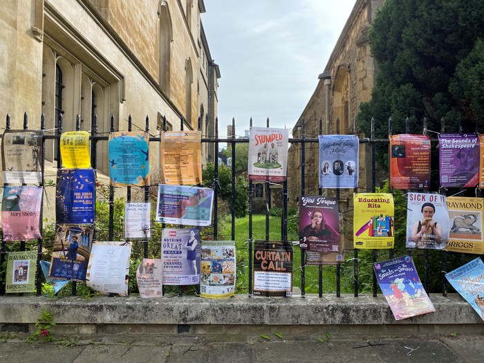
Posters are an inescapable aspect of the Cambridge landscape. If there’s ever an exposed railing, you can be sure that there will be at least a dozen colourful posters zip-tied onto it, promoting any and every show no matter how big or small. While the deluge of posters might be considered an eyesore in this historic city, there’s something special about the fact that each production, even temporarily, has its own carefully created piece of art to speak for it around town.
Deciding on the best posters of the year is a difficult task. There are many things that go into creating an eye-catching masterpiece. The best posters offer indicative views into the shows they promote, while also being impressive pieces on their own, completed with care and consideration of style. A unique, unexpected, yet clear approach can grab a passerby’s attention, sparking questions without causing confusion.

Anna Piper-Thompson’s design for the European Theatre Group’s December production of Hamlet strikes a great balance between recognisable iconography and distinct, unique style. Piper-Thompson’s rendering of the famous Hamlet skull with thick brushstrokes in blue, grey and even mauve communicates both the energy and turmoil of the character and the chilling, eerie nature of the play. The simplicity of the poster’s dark background and stark white font keep the viewer’s undivided attention.
“There are many things that go into creating an eye-catching masterpiece”
Stylistically similar is Piper-Thompson’s design for Blood Relations, another story brimming with psychological terror. Delving into the mind of a woman accused of murder, the segmentation of the gaunt face on the poster gives it a distinctly unreal feel, contrasted with the title of the play which itself looks painted in blood. When asked for her advice to anyone looking to get into poster design, Piper-Thompson recommended: “applying your own medium to poster creation”, and not being afraid to give it a go – even if there’s a learning curve at first.

Easily one of the most surreal posters this year is Frankie Browne’s design for Bulgakov’s adapted Soviet satire, Heart of a Dog. Much like the recognisable Hamlet skull, the heart itself features in the centre of the poster, horrifically squeezed above the eye of the scientist who created the beast, hinting towards the show’s black comedy. While most posters are designed digitally, this one is hand-drawn, the bright technicolour of the bombastic dog contrasting with the helpless human figures. Browne was inspired by USSR propaganda posters, which feature jarring blends of colour, bodies and faces. The mangled, jumbled up figures here mimic these and reflect the play’s central focus of the chaotic reanimation of a lowly dog with human body parts.
“Even the work of a student or first-time artist can be featured throughout the town”
Similarly, Browne’s poster for 1984 almost affronts the viewer with its boldness. Winston tears through the poster out of the background of endless static, desperate for his voice to be heard. For a text as famous as 1984, it is unsurprising that its poster should jump out at its viewer. When asked for advice, Browne advised looking for shows which excite you like “the art you make already,” ensuring passionate and natural design.
Katie Wrench’s design for Indecent attracts via its simplicity, this time presented in the form of a collage. The Sepia-toned photograph of ships in the background brings to mind the play’s early 20th-century setting and contrasts the black-and-white female figure atop it, reflecting the play’s key concerns of the immigration, sense of displacement and alienation of the Jewish population it follows. The central female figure, once “indecent”, is covered up and anonymised with a simple piece of tape, rebelling against the censorship of the struggles of the past. All this is completed with the title cleanly done in English and Hebrew.

Wrench described the sometimes challenging process of working with a production team to find an ideal poster, especially considering the time pressure in Cambridge theatre and the difficulty of perfecting a design from many initial ideas. She stressed the importance of open communication and remembering the amateur aspect of student theatre, where everyone is innately providing each other with favours and looking to take advantage of all the opportunities that Cambridge offers.
Poster design can often seem daunting, something best left to professionals. But the great thing about the Cambridge scene is that even the work of a student or first-time artist can be featured throughout the town, embodying a production which the whole crew has worked hard on. If the experiences of current designers is anything to go by, it is clear that nothing should deter someone from trying their own hand at publicity design. Creative vision, drive, and ideas are always more important than experience or expensive materials. Every poster is its own work of art, and we look forward to even more great ones next year.
 Comment / The Cambridge drift1 June 2026
 Theatre / CUMT’s The Wind in the Willows brings a classic to life 31 May 2026
 Features / The language of optimisation and the architecture of merit30 May 2026
 News / Venue cancels Cambridge talk by right-wing commentator Matt Goodwin after backlash28 May 2026
 Interviews / ‘Thank you for the music’: ABBA Support Society on friendship and managing stress through fun 31 May 2026
 News / Cambridge psychologist warns against blanket social media ban for under-16s1 June 2026
 Sport / Caius beat Magdalene in last-minute thriller to clinch mixed netball Cuppers final1 June 2026
 News / News in Brief: Corpus climbing, climate cash, and commendable contributions1 June 2026
- Comment / The Cambridge drift1 June 2026
 Fashion / From princesses to PAs, power dressing is nothing new31 May 2026