Vintage Varsity: a visual history
Resident archivist Amelia Platt takes us through the photographs, cartoons and front-covers of Varsity’s past
In the world of newspaper journalism, our attention tends to be on the text – from attention-grabbing headlines to killer quotes. Amid all of this, it’s easy for visual elements to be overlooked, seen as secondary, and ultimately forgotten. When we look back through old editions, we’re usually searching for events in type. Then, we end up quoting the words, not pictures. With this in mind, I visited the Varsity archives.

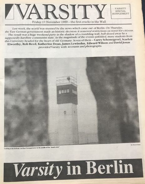
I began by looking for photography – a perennial concern for editors, especially in the days when film photography was costly and time-consuming. An editorial note from the 1950s states: “Varsity wishes to buy photographs taken during the long vacation. These should relate to post-war reconstruction, economic conditions, etc., abroad.” Placed in a small box on the page, the note is relatively unassuming. But, fascinatingly, it shows how Varsity, through its photography, was interested in positioning itself not only as a Cambridge-based student newspaper, but also one interested in world events; this stance continued until at least 1989, when photos documenting the fall of the Berlin Wall appear, which were taken by Varsity students present in Berlin at the time. From the West Berliner helping to knock the wall down to cheering crowds greeting an East German family as they enter West Berlin, these photos provide a fascinating snapshot of one of the biggest events of the 20th century.
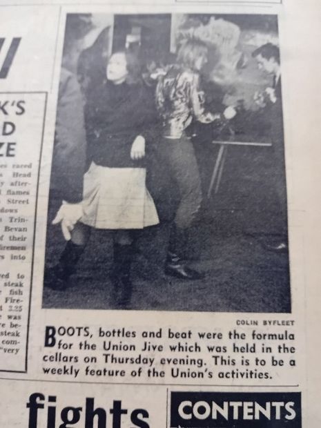
The role of the caption should not be understated: helping photos to weave a whole narrative in their own right. The impersonal nature of a photograph of a group of men in top hats and black tie, crowded around a bonfire (with all the privilege and precarity of 1950s Cambridge), is undercut through the short caption “Damp and Dreary night”. Or there’s the innocent photo of a table laden with Burns Night decorations. The caption, though, illustrates the other side of the story: “Haggis and Whiskey sold out in Sainsbury’s on Wednesdays, when Scottish students loosened their fists and prepared for Burns night.” My favourite photo captures a group of students dancing at the inauguration of the “Union Jive”. The picture is slightly fuzzy, signalling the challenge of capturing figures in motion. It also, however, brings the students to life; it reminds us of their status as real people much like us, allowing a connection to be formed across the decades. In so doing, it displays the best of the many things photography can achieve.
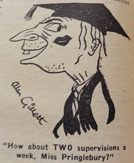
Alongside photography, early editions were particularly fond of the cartoon – keen to skewer Cambridge and those within it. They often act as a barometer of social values. One cartoon, for instance, sketches a don, complete with a lipstick smudge on his cheek, and boasts the caption: “How about TWO supervisions a week, Miss Pringlebury.” An uncomfortable insight into gender politics is provided. Not all illustrations are satirical, however. Take the following from a Lent 1964 edition. In hand-drawn lettering the illustrators express a Happy New Year to all wannabe creative producers, establishing a truce of sorts before the inevitable conflicts promoted by reviewing arise. Love triumphs in a full-page illustration of the 1989 “Varsity’s Valentine’s Quiz”, a serious business which promised winners “two air tickets to Paris”. The illustration is inventive: the font that spells out “Valentine’s Day” becomes an actual heart. Dotted around the page are cherubs, equipped with the classic Cambridge accessories of a mortarboard and bike. One cherub cheekily holds up a book titled “Book of Very Difficult Questions”.
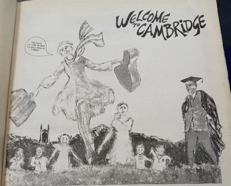
Another stand-out piece of illustration is from an edition titled “Freshers’ Special”, published in Michaelmas 1990. Here, in a tribute to The Sound of Music, the fresher is reimagined as Julie Andrews running up the green hills (definitely an invention) of Cambridge. On the right-hand side of the image stands a dour don. Shaded darker and looking as if he is about to put a stop to all this fun, he is utterly conspicuous. The suggestion is that The Sound of Music analogy won’t last for long.

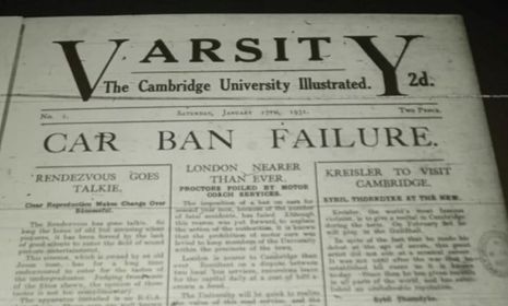
No conversation about Varsity’s visuals would be complete without exploring past Varsity covers. The first ever Varsity edition was published on January 17th, 1931. Its appearance adhered to the conventions of the classic broadsheet. On the front cover, the “V” and “Y” of Varsity are enlarged – creating a box that encases the subtitle “The Cambridge University Illustrated”. It would appear that the only thing which separated Varsity from the University itself is its use of illustrations. Although Cambridge-focused, the visual emulation of national broadsheets is reflective of Varsity’s audience’s aspirational nature. A section runs every week on “London Theatres” seeking to provide a cultural commentary beyond the immediate bounds of student life. And, only three issues in, Varsity is already involved in a spat with London Newspapers, the headline reading “LONDON PRESS CHALLENGE: VARSITY VS DAILY EXPRESS”. They disagree over whether Cambridge provides a “pseudo-education”. The Daily Express defends Cambridge, whereas Varsity itself disagrees. Even in these seriously-written early editions, there is still an irreverent playfulness. Inside the cover of the January 1931 edition, the page is formatted to include a space for an editorial note, stating rather pugnaciously: “We do not apologise for our birth.” I would argue this sense of playfulness is one of the key characteristics of Varsity’s style – an ability to blend the serious with a note of fun.
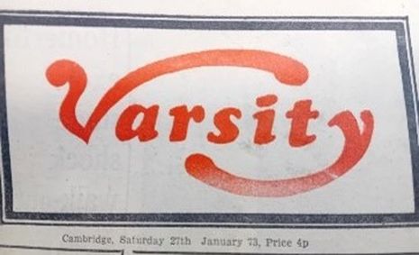
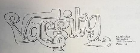
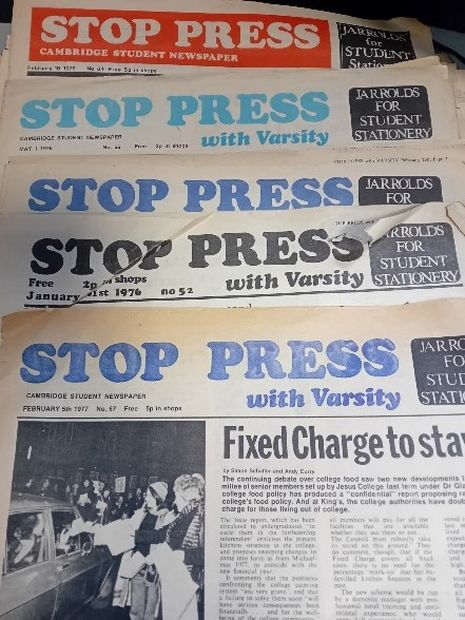
Elegant, serif headers are standard for the next few decades. By the ’70s, however, editors are becoming more experimental. Indeed, the experimentation of the ’70s perhaps shows Varsity’s willingness to be ‘fun’ at its very best. Titles change rapidly, shifting colours, sizes, styles and overall design. They shift from black font, dark blue, light blue, and red font, to white font on a red background over a couple of years. There’s a rejection of continuity, a willingness to keep changing things up, and perhaps a recognition of student culture as its own, faintly immature, genre – one which can be legitimately reflected in a student newspaper. The immaturities of the ’30s are generally relegated to formal text and obscured by formal typography. A 1972 edition particularly stands out for its inventiveness, with the letters of the titles melting into one another. Towards the end of the ’70s, Varsity merged with radical newspaper Stop Press in an attempt to combat financial pressures. By the 1980s, Stop Press dominates the front cover with a white typeface on a red background. You have to look hard to spot Varsity, relegated to a tiny spot below Stop Press, an apt visual illustration of the politics of student journalism.
The other distinctive period of Varsity’s cover design history is its ‘tabloid era’. It’s hard to pinpoint exactly where this period begins and ends; we seem to get recurring instances of it, but the early 2000s stand out as a heyday. Covers display dramatic, short headlines. A prime example is the November 9th, 2001 edition’s: simply one word, “SHAMED”. It’s written in white, block capitals placed on a black background – immediately reminiscent of The Sun or the Daily Mail. This particular cover also advertises a “special colour pull-out,” promising an introduction to Cambridge’s most eligible bachelors. (side note: one of the bachelors featured is Conservative MP Robert Jenrick “appearing to be a gentleman […] but you can’t help feeling there’s something hidden behind it all.”) The visual also forms an important way in which the era’s preoccupation with sex is manifested. Another example, coming a few years later (2008), is the rather racy photo that accompanies Issue 669’s results of a sex survey conducted by the paper (complete with the hard-working headline of “Penetrating questions”).

There are instances of the visual design from this period which leave us with a nasty taste in the mouth – much like the stories they accompany, which often seem to work on a basis of exploitation, particularly in relation to the female body. The potentially cruel edge of the tabloid is perhaps something readers became less willing to engage with as the years went by, leading to the shift away from a more tabloid-esque design. Maybe it is also true that we are less likely to be shocked today; we want the design to do more than just provide cheap thrills.
Today’s Varsity covers look quite different. The navy blue header with white font (first seen back in 2016), signals an increasing desire on Varsity’s part to be taken seriously. It reflects a shift away from ’80s irreverence and ’00s scandal towards a look that calls to mind The Guardian more than it does The Sun. The visuals are more professional and created with digital software. We’ve retained a sense of fun with student illustrations, but they’re done with iPads, not felt tips. It’s possibly a sign of a wider culture change in universities, as their commercialisation has meant that we pay thousands of pounds for the promise of a career, rather than embarking upon the student lifestyle for free. It was probably easier for a student who wanted a career in journalism in the ’80s to see a student newspaper as more of a lark. Today, there’s a greater awareness of how Varsity can function as an important stepping stone to a competitive job market. As such, the professionalism of the visuals becomes very significant in helping the paper to suggest its value and importance.
I am aware that I’ve just written a large number of words in an attempt to explain the visual. Hopefully, though, the visuals still speak for themselves. When we look at editions across the years, the actual look of the text tends not to change much. We have to read the words closely to grasp the context of the paper and work out an understanding of the period. Yet, as soon as we open a paper and look at the visual elements, we get an instant sense of the paper’s ‘atmosphere’ and its wider context. They humanise the paper: from the blurred photographs of students dancing at parties, shouting at protests, dressed in black tie, to the contributors themselves, curled over their desks, working at cartoons. We get that humanising in the writing too, but it’s made uniform by reproduced fonts and edited text. The visual communicates individual expression and artistry, speaking to us in a way that nothing else can.
 News / John’s professor awarded $1.4m Templeton Prize30 April 2026
 News / Two more women allege sexual harassment by classics professor Simon Goldhill 28 April 2026
 News / Cambridge OCR fined £270k for exam paper errors27 April 2026
 Comment / Drinking or drowning? The hidden culture behind C-Sunday1 May 2026
 Comment / The bubble tea spectacle29 April 2026

