Judge a Book by its Cover?
Sam Hunt looks at a form of art we see everywhere in order to question the cliché

Who would have thought it – the artist of the iconic blue and red image of Obama, entitled “HOPE”, and released for the 2008 American presidency election, is equally a book cover designer. Shephard Fairey, having begun his career in designing images for skateboards and T-shirts, has created the covers for both Nineteen Eighty-Four and Animal Farm for Penguin books. Bold, political, expressive – the characteristics of his controversial nature are all there, even the tri-chromatic simplicity – with a focus upon a vivid, Communistic red – all fall into place. In Fairey, there is an example of what we ignore everyday as we glance over the multiple books we desperately skim-read: the book cover is an ignored work of Art in itself.
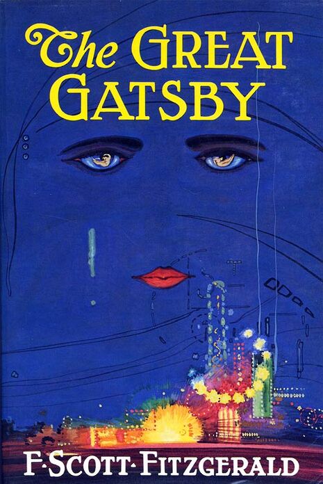
Take one of the most famous images to ever adorn the front of a novel – two black rimmed and sultry eyes gaze out of a blue back-drop over the yellow glow of a city horizon. If you don’t recognise the reference, this is the original cover for F. Scott Fitzgerald’s The Great Gatsby from 1925. Is it just a book cover? The posters and postcards available in Heffers suggest otherwise, making iconic images like this one into a replication to decorate student walls. Francis Cugat, the painter of the design, takes the image of the fading billboard eyes of optometrist T. J. Eckleburg and alters it, turning them instead into the un-spectacled, gazing eyes of a woman. The face melds into the dark blue of the night-sky, presiding over the fluorescence of the sleepless city.
Into this image, Cugat attempts to pull together the entire novel, one of the ultimate American Classics, portraying a decayed dream of futurity and the painful conclusion of inevitable modernity – all in a single space. The cover now becomes of sudden curious importance – that sheath we push past without noticing is more than just protective binding, it is the visual expression of the pages in our hands.

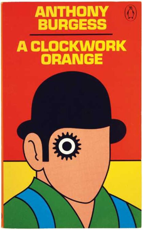
Book cover illustrators are the under-sung creators, despite working on the art we encounter every day of our lives in some fashion. David Pelham, for example, created the famous Penguin cover for A Clockwork Orange, with its background of orange and yellow blocking, its central figure in a bowler hat, who has one black-rimmed and unnaturally circular eye. It is bold and chilling – recognisable to lovers of literature everywhere in projecting the novel in an artistic interpretation.
Almost everyone in Cambridge comes under the influence of art and design through the medium of the subtle book cover, even if it comes in the form of a Physics textbook. It is a medium of packaging that advertises the product, attempting to make you into a guilty consumer of knowledge and pleasure.
If you find yourself interested, a beautiful website on book cover design, called http://bookcoverarchive.com/ is a fruitful form of procrastination.
So, the next time anyone pipes in with their tiresome cliché – “Never judge a book by its cover” – ignore them. Do the opposite – “Judge the cover in relation to the book”, and become critical of its artistic interpretation: there might be more to it than you think.

Don’t ignore the art just under your nose.
 News / Uni Scout and Guide Club affirms trans inclusion 12 December 2025
 News / Pembroke to convert listed office building into accom9 December 2025
 News / Cambridge Vet School gets lifeline year to stay accredited28 November 2025
 Features / Searching for community in queer Cambridge10 December 2025
 News / Uni redundancy consultation ‘falls short of legal duties’, unions say6 December 2025


