
Living Coral: 2019’s colour crush
Discover the many facets to Pantone’s colour of the year, and get inspiration for how to wear the shade set to dominate 2019
by 
2019 is the year where we’ll all be living in coral pink - at least, that’s what Pantone is predicting. Given that the colour institute carry out some pretty rigorous investigations, such as sending a team to scour the globe and collate their findings throughout the year to reach this conclusion, I wouldn’t dismiss them out of hand if you can’t immediately see yourself wearing a hot pink dress during this year’s May Week.
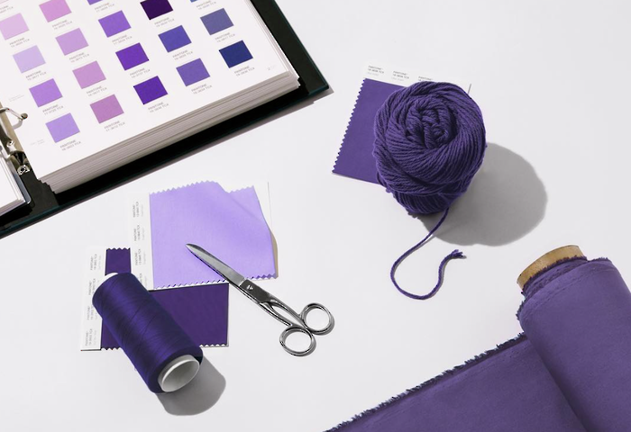
Annually, the colour institute picks a shade that defines our times creatively, socially and politically. Last year the choice was Ultra Violet: a mysterious and multifaceted purple. This year, Pantone tells us it is Living Coral that we are gravitating towards.
More “natural” than last year’s other-wordly shade, the muted terracotta seems to bridge the gap between the nature and fantasy. It is both earthy and fantastical. The golden pink exists in the natural world in the most spectacular ways; at the boundaries of nature, transcending the believable. For me, it evokes a burning sunset: bold yet ephemeral.
its visual association with deep-sea coral leaves the colour less stabilising and durable than it might seem
It isn’t static but has currents of pastel pink, orange and golden hues running through it. Anna Burns’ book Milkman, 2018 Man Booker prize winner, sees the protagonist describing a sunset-filled sky as “a mix of pink and lemon with a glow of mauve behind it” - a symbol that “anything could be anything, that anything could happen.” The images of endless possibility that the colour represents in some of the best literature of the year feels significant, especially in a book which paints the sunset as a plane of hope in contrast to the insecurity, political and social strife going on.
Reflecting on the poignancy of the purple shade that was last year’s pick, I discussed the political and social inferences we can make from the colour. Specifically, it symbolised a continued movement within the fashion industry towards gender fluidity and androgyny, with allusions to historic and contemporary women’s movements.
While recognising that I have a tendency to search for the political in everything, this year’s pick is no less so. Bright and energetic, perhaps the vitality and warmth of the colour is a cry for positivity in a world that can often feel dark and uncertain. In contrast, the earthy tone emits an anchoring feeling.
Living Coral seems to speak to the growing awareness of an industry, indeed of humanity, to the environment
Yet its appearances in nature perhaps show a less durable side to the colour. As with the ephemeral, fluctuating sky of a sunset, its visual association with deep-sea coral leaves the colour less stabilising and durable than it might seem.
It is the colour of life then, but also one that evokes the alternative. “Living Coral is evocative of how coral reefs provide shelter to a diverse kaleidoscope of color”. The direct reference Pantone makes to the “mass mortality” of coral reefs in recent years is poignant. More widely, it is telling of the deepening focus being placed on the environment, not least within the fashion industry.
With 2018 having seen fur banned at London Fashion Week, a perceptible, albeit slow, knuckling down on the issue of sustainability can be seen more widely at all levels of the industry. Following industry forerunners such as Vivienne Westwood and Stella McCartney, Living Coral seems to speak to the growing awareness of an industry, indeed of humanity, to the environment.
Its association with life reflects more than a growing awareness of the planet. Authenticity is a buzzword we increasingly hear - we’re craving authentic experiences, online and “out there”. As marketable as the term has become, there is something to be said for the desire to garner experiences that feel “real”, whatever that means in a digital age. Pantone’s choice of colour certainly taps into this. Executive director of Pantone Colour institute, Leatrice Eiseman, explained in a statement about the choice that “consumers [are] craving human interaction and social connection”.
Far from dictating to designers the colours that will fill their creative palettes this year, Pantone’s choice is influenced by the work of creatives in the industry among other social, cultural and political factors, as is the nature of the runway-to-real life relationship. It is in part because the peach shade has been so heavily featured in the fashion world that it has been named the colour of the year.
From Prabal Gurung’s hot pink bikini tracksuit to Marc Jacobs much talked about stunning head-to-toe pink blush looks - with Josh Wood’s baby pink buzzcuts to match - the shade has been dominating Spring/Summer 2019 collections. The plethora of shades contained within the coral palette will make it a shoe-in for the incoming Autumn/Winter shows too. With hot pinks, daring orange, and all of the earthy, golden shades in between, the options for your own wardrobe are also endless. Its versatility is what makes the colour surprisingly easy to wear.
If you look around on the high-street at the moment, you’ll be able to find some really great pieces in colours resembling Pantone’s choice. I’ve picked out some of my current favourites to give you some inspiration for your own wardrobe. Whether that’s picking out a piece from here to update your look, or re-wearing something that you’ve long-forgotten, Living Coral is an easy colour to draw inspiration from for a fresh look throughout the year.
Coral has spent sporadic time in the limelight throughout the twentieth century. A runway highlight in the 40s and 50s, having a rummage around some thrift shops could be incredibly lucrative now the colour is back in vogue (literally). Finding some vintage pieces to re-style the peachy shade that is making a comeback is a perfect way to master an authentic spin on the shade of the moment.
Such a strong colour for a classic piece like a satin shirt is perfect for anyone taking inspiration from Balenciaga’s SS19 runway collection where soft, brown-toned orange shirts were paired with jeans and a silk scarf. The more earthy undertones of the colour can be drawn upon to pull the shade into your wardrobe in a subtle way.

The peach tone lends itself to spring styling. Wear a dress or suit in a brilliant pink or an eye-catching orange to create both on trend and vibrant May Week looks. See WYLDR’s two-toned maxi dress which Topshop are currently stocking. Alternatively, take a look at &OtherStories’ striking apricot orange suit for more of an investment piece.

If you’re attracted to Living Coral but can’t quite see yourself living in coral clothes this year, beauty is a subtler way to incorporate Pantone’s shade of choice. Glossier’s Generation G lipstick in the shade Cake for example is a perfect peachy lip colour - you could also wear it on your cheeks for a lived-in, no hassle make-up look à la every Vogue ”get ready with me” video.
A colour of hopeful ingenuity, it holds within it the brilliant creativity of an industry brimming with life and also the best of the natural world. Perhaps the colour is the beacon of hope we need to pull is towards the creative solutions required to re-think our attitude towards many issues both within and outside the fashion industry.
 Comment / Top of the slops: the competitiveness of college dining4 June 2026
 Interviews / What’s the story behind Pages coffee house?8 June 2026
 News / News in Brief: Cambridge crowns, council confirmations, and competitive cricket8 June 2026
 Comment / The Cambridge drift1 June 2026
 News / Cambridge researchers produce ‘world-first’ AI vaccine6 June 2026
 Theatre / The recipe to success this Easter term 10 June 2026
 Music / To Be Forever Yung10 June 2026
 Comment / ‘On the Poverty of Student Life’: sixty years on10 June 2026
 Arts / Don’t rush me – I’m reading!9 June 2026
 Lifestyle / Don’t Cry at Me, Argentina – a next-year abroad story8 June 2026