Pantone Colour of the Year 2022: The colour purple…or should that be blue?
Is this year’s colour confusing and indecisive? Possibly so, argues Gabriel Humphreys

As we step into the new year, we’re once again bombarded by trend reports, as everyone from pundits to brands and influencers tries to grasp what has been prominent in the last year, and what will be in the year to come. An ever-present feature in this cycle is Pantone’s Colour of the Year, chosen carefully by an international team, and now in its 23rd year. Entrusted with capturing both the creative and cultural climate, this single colour aims to transcend all other trend reporting, purporting to set the tone (quite literally) across not only fashion, but also interiors, homeware, and graphics.
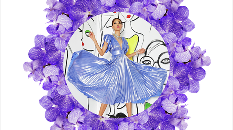
This year’s choice is Very Peri, a periwinkle blue-purple that is also the first of Pantone’s Colours of the Year to be created from scratch, as opposed to chosen from their vast encyclopaedic colour catalogue. It sits at what I would call the exact midpoint of blue and purple, and after staring at the colour for hours on end trying desperately to pick one side, I feel as if a blue and black vs. white and gold style fight might break out in my own brain. Put a gun to my head though, and it’s a purple.
“Ethereal and liminal, this tone that resists classification so strongly appears an odd choice”
Purple dyes have an interesting history – the earliest were made in the 15th century BC from curing the tiny gland of a sea snail in sunlight. The process was nuanced and lengthy, with thousands of snails being required to produce any real quantity of the dye. It was also extortionately expensive – in 2000 an attempt to make just one gram of the dye by the original formula required 10,000 molluscs and cost £2,000. As a result, purple fabric was the preserve of royalty and the fabulously wealthy, becoming the imperial colour of both the Byzantine and Holy Roman Empires, and surviving a slump in popularity in the Middle Ages to begin adorning royal bodies again from the 18th century onward.
As a result of this storied history, purple has persistently been associated with royalty and wealth, and by extension imperialism, extravagance, and greed. Pantone, however, chooses to disengage from the negative connotations of their chosen colour. They espouse in their press release that “society continues to recognize color as a critical form of communication”, yet it feels that we’re not allowed a complete vision of what this colour communicates. By refusing to approach the subject more profoundly, I think they do a disservice to the story-telling power of colour, and run the risk of undermining their own messaging.
The explanation is simple. The priority here is not really the narrative of colour, but rather the market for it. They are keen to wax lyrical about its positive qualities, but would rather ignore its possibly troubling connotations, as it might put a designer off using that colour in their collection or buying one of Pantone’s many themed and limited edition Colour of the Year products. Perhaps it is fitting at least that this colour remains an economic opportunity for those producing it, much like it was thousands of years ago.
Returning to the colour’s relevance for 2022, I still feel unresolved. Ethereal and liminal, this tone that resists classification so strongly appears an odd choice. But it is, I think, an astute pick, though for a rather different reason than they provide.
“It is more symbolic of the constant uncertainty we now feel permeating our everyday lives”
Pantone aligns the ambiguity of the colour with creativity, inventiveness, and change – it is an unabashed, unrestrained signal of artistic imagination. For me though, it is more symbolic of the constant uncertainty we now feel permeating our everyday lives. We’re heading into year three of a pandemic, among ever-increasing political disunity and dissatisfaction, not to mention the looming possibility of economic turmoil and the ever-present spectre of the climate crisis. And what is more, little progress seems to have been made on fighting these burgeoning anxieties with any great urgency – I find no little irony in the fact that purple is directly opposed to yellow, one of 2021’s Colours of the Year, on the colour wheel. Given recent experience, the oncoming year does not feel like it will bring us the reversal of fortunes that the symbolism might suggest.
It seems to me that Pantone has struck gold almost by accident, conjuring a colour that exists in a confusing oscillation between blue and purple and is therefore perfect for a world in which it feels less and less easy to be totally certain of anything. And it seems we might not be the only ones feeling like a status quo has been permanently disrupted.
All the stops have been pulled out for this particular colour of the year – the mixing of a new colour for the first time – and last year’s pick came with a novelty edge too as two colours were chosen simultaneously, which had only previously happened in 2016. Perhaps Pantone is realising that in a post-pandemic world they are losing some of the cultural colour hegemony that they used to enjoy. After all, these moves feel like marketing techniques designed to prove Pantone’s adaptability and relevance.
The last two years have seen a serious cultural shift, with previously reliable cultural pillars being forced to adapt to new circumstances. Film releases have quite possibly changed forever, and the future of in-person fashion weeks remains unsure. Simultaneously, the nature of trends themselves has shifted, as they either shrink to the length of one swipe on a For You page, or cease entirely as fewer people engage with them in an attempt to eschew the conspicuous consumption they implicitly encourage.
Trend reporting remains a variable business, sometimes attracting both ire and fascination. Perhaps Pantone is right to feel slightly out-of-step with the cultural zeitgeist, but much like Very Peri, even that seems uncertain.
 Comment / Drinking or drowning? The hidden culture behind C-Sunday1 May 2026
 Features / ‘It was genocide, not a civil war’ – Cambridge University Tamil Society remembers the Sri Lankan Civil War2 May 2026
 News / Protesters call for regime change in Iran2 May 2026
 News / John’s professor awarded $1.4m Templeton Prize30 April 2026
 News / Two more women allege sexual harassment by classics professor Simon Goldhill 28 April 2026


