The font of all knowledge? Probably Calibri…
With the simpler days of popcorn-scented gel pens a distant memory, Will Hall takes a tour of typography

I recently got an email from a friend who suggested that my use of the unadventurous typeface Calibri made me seem boring. It was a vanilla font: appropriate, sensible, cautious. Normally I wouldn’t think much of this kind of remark, but for some reason (definitely not the fact I needed an idea for this column) it stayed with me.
I found myself remembering my first childish forays into Microsoft Word, hours spent with friends playing with the dropdown menu of fonts: that litany of typographical opportunity that so thrilled the early computer user. Don’t even get me started on Word Art. (These were simpler times).
Of course, it didn’t start there. What we nineties kids, suckled on S Club 7, Furby and MSN Messenger, experienced before the era of the screen was the humble pen and ink: handwriting. Our scrawl was our own longhand-brand, and what we lacked in digital precision we made up for in manual individualism.
I hope you’ll forgive my somewhat nostalgic fondness for the days of the inkwell, the exercise book, and Berol the handwriting pen, but mine is the story of a transformation. Well, sort of.
When I was eight, my writing was so illegible I had to be sent off for lessons with a nice woman called Mrs Caxton, who turned my indecipherable scribble into a thing of beauty. Sadly, I think I lost my neatness of hand at around the same time as my flexible ruler (translucent aquamarine, since you ask), but there was a period in the early noughties when I had the handsomest handwriting in the class.
I still can’t listen to ‘Never Had A Dream Come True’ without thinking of baggy jeans, Tracy Beaker and practising my letters in popcorn-scented gel pen.
My newly-acquired penmanship (which I still maintain should be recognised as a sport) even won me the handwriting award at the annual prize-giving, the only problem being that this was widely acknowledged to be the Anthony-from-Blue of the prize world, given to the student who didn’t have anything else but needed rewarding because the school had over-ordered from The Book People.
As my friends waltzed past with accolades in English, Maths, and History – proper subjects, I thought – I was left licking my impeccably joined-up wounds. Anyway, I’m totally over it now. Honest.
Perhaps it is this childhood chirography which sees me reminisce so fondly about the scratch of the nib, but regardless, today’s world is no place for handwriting, which is now seeing out its retirement in a nursing home off the A303, along with landline phones and the VCR.
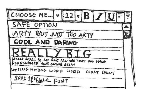
In our 21st-century e-world of e-books and emails, computer fonts are the great e-qualiser. (I’ll show myself out.) But they also present each and every one of us with an overwhelming choice, the same choice little Will had with the dropdown menu: which font to use?
Before the great Calibri schism of 2007, Times New Roman (TNR) was every typist’s go-to guy. Smart and intelligent without being tweedy or outmoded, it also had the huge advantage of being the default font. Any deviation from TNR was a statement in itself – it screamed ambition, a desire to be different, and an acute knowledge of how to use Microsoft Word.
But for those who did wish to stray beyond the bounds of all known convention, a whole world of fonts awaited, staring at you right in the typeface. Arial: a cool, modern contender to the throne, the ultimate in suave, 21st-century, sans-serif messaging. Efficient without being economical, and always backed-up by its lesser-known, thicker-set brother Arial Black, and their kind but timorous cousin Arial Rounded.
Then there’s Cooper, the American guy-next-door font, who worked as a summer camp counsellor and now spends the weekend making s’mores (best viewed in size 12 – 11 doesn’t do it justice), and Bradley Hand, a bowtie-wearing English teacher currently penning his debut novel.
Some of the more outlandish options include the Wild Western Goudy Stout, the font equivalent of tumbleweed, or Bauhaus 93, an artistic dreamer who ran away to start a pay-what-you-can hostel in Mexico. Georgia is a liberal arts student who performs in slam poetry gigs on Thursday evenings, while Franklin Gothic has a secret past which none of the other fonts have ever been able to get to the bottom of.
You see, fonts aren’t merely incidental: they are just as important as the words you type with them. They are characters. They have personalities. They tell a story. Either that or I need to get out more.
 Features / The rise of the June Event 5 April 2026
 News / Construction begins on controversial Queens’ accommodation6 April 2026
 News / Downing law society banned from holding formals in College for a year31 March 2026
 News / Record-breaking £190 million donation will fund new Cambridge School of Government2 April 2026
 News / Missing Sidgwick sculpture spotted in Oxford 1 April 2026


