Pick up a Penguin
The royal mail has just named the penguin paperback a British Design Classic. Laura Freeman meets award-winning Penguin Designer Coralie Bickford-Smith to talk about knives, Robinson Crusoe and reinventing an icon
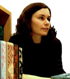
Coralie Bickford-Smith has two mottos. The first is “stop designing, start playing”, and the second is “make a big mess”. And a fine mess she has made too in the freshly painted Penguin offices overlooking the Thames. When I arrive, a mass of hardbacks and paperbacks are spread across the table: a fuchsia Treasure Island the colour of a Ladurée macaroon, a dove-grey Wuthering Heights with thistles twining across the cover, a pile of Gothic Horrors decked out in sinister shades of yellow, and a sumptuous three-volume set of The Arabian Nights that would make Sir Richard Burton weep. Coralie presides over this circus of colour like a proud ringmaster and is loath to pick a favourite. No sooner has she decided on The Man Who Was Thursday, than she transfers her affections to Crime and Punishment. No, The Spook House. No, wait, The Picture of Dorian Gray. With each new pick, the mound spreads, haphazard piles are assembled and dismantled, favourites are resurrected from the bottom of the heap and Coralie’s cyanotypes litter the table top. As messes go, it is a uniquely beautiful one.
In person, Coralie is quietly dressed in black, shy and hesitant, but get her onto the subject of books and she is transformed. One of life’s natural enthusiasts, she falls into paroxysms of delight over such seemingly dry subjects as typography (which she studied “big time” at Reading), plastic kitchen utensils, and children’s alphabet books.
 Coralie describes her four years at Reading with great fondness, reminiscing ab out her dissertation on the history of the illustration of Robinson Crusoe and the fiendishly difficult type identification exam. Her enthusiasm only falters when describing the years she spent working on ‘Loyalty Magazines’ for Sainsbury’s and British Airways. The frequent flier magazine proved a dull and unrewarding career choice and Coralie “ran away”, setting up as a freelance designer. Her stint as a freelancer didn&rsqu o;t last long, though, and she was swiftly snapped up by Penguin, where she has been “happily stuck ever since”.
She makes it sound like a fairytale: the unhappy runaway who found a Happily Ever After at a major publishing company. She evidently has a knack for such things. Fittingly, her first great success was a volume of Hans Christian Andersen fairy tales, published in 2004 and now in its sixth hardback edition. The success of the magenta and burgundy Andersens opened Penguin’s eyes to an apparently renewed desire for beautiful, cloth-bound books among the members of the reading public – books as covetable collectors’ items rather than unremarkable vessels for a little light reading. Fresh from her fairy-tale success, Coralie took the helm.
Between June 2007 and June 2008, Penguin published twelve paperbacks in the Boys’ Adventure Classics series, among them The 39 Steps, Tarzan, and Around the World in Eighty Days, swashbuckling tales all. The set was commissioned following the triumph of HarperCollins’ Dangerous Book for Boys, which dominated the 2006 bestseller lists. With the Boys’ Adventure Classics, Coralie’s task was immense: twelve books by ten different authors, set on half a dozen continents, featuring subjects as diverse as dinosaurs, pirates and First World War espionage. The challenge was to unite these disparate stories in a cohesive series, while giving each book a clear and immediate bookshop identity. Undaunted, Coralie commissioned four illustrators to produce black and white illustrations while she researched typefaces. She is particularly proud of the disjointed Dada Futurist type on the cover of G.K Chesterton’s The Man Who Was Thursday, which she relates to the novel’s central theme of anarchy and the disruption of the social order.
Coralie works closely with the text when presented with a series such as this, dutifully reading each book cover to cover. She admits that she had never read any of the Boys’ Own Classics before working on the Adventure Classics series, bu t she says she has since been converted. “This one’s brilliant,” she beams, picking up Anthony Hope’s The Prisoner of Zenda, “and this is fantastic,” she adds as she delves into a box to retrieve Rupert of Hentzau. “It’s the sequel.” The pile swells with every new favourite.
The books’ black-and-white illustrations are set against Technicolor backgrounds that don’t pander to any notion of a ‘blokeish’ colour scheme. There’s that macaroon-pink Treasure Island, an Around the World in Eighty Days decked out in parachute silk turquoise, a desiccated, dusty yellow for The Riddle of the Sands, and pillar-box red for The Prisoner of Zenda. Coralie admits to “obsessing about design” and being “anal about finish”. She observes ruefully, “It’s my job to push the beautiful finishes, and it’s someone else’s job to sit down and work out the budget.”
In the case of the Boys’ Adventure Classics, the budget was restricted, but that isn’t always the case. Here Coralie unveils her pièce de résistance, her favourite favourite, the three-volume set of The Arabian Nights. With each set selling for £125 a pop, Coralie was free to indulge in all the beautiful finishes she could wish for. The elaborately patterned covers, inspired by the tales of Aladdin, Sinbad the Sailor, and Ali BaBa and the Forty Thieves, were borrowed from antique Persian manuscripts, and are picked out in silver and blue on fine linen paper. The lavishness of the set – linen covers, exquisite endpapers, and pristine cotton spines – is a perfect masque for the Nights. After all, what are Aladdin and Ali BaBa about but the hoarding of beautiful treasures?
Coralie is eclectic in her inspiration. When she isn’t plundering Dada or Persian archives, she is buying 1950s kitchenware from eBay (her own kitchen knives take a star turn on the cover of Ambrose Bierce’s The Spook House), old typography books, and vintage wallpaper samples. “I drive my boyfriend mad,” she concludes. When asked to pick an inspiring designer from the Penguin archives, she nominates Romek Marber, who worked for Pen guin in the 1960s and revamped their crime series in eye-watering, electric green.
Coralie cites Marber as the inspiration behind her Gothic Horror covers. These are a darker affair, confined to two hues, a ghastly blue and yellow, like a corpse dredged from the river. The idea came from an unlikely source: sunlight paper, a children’s stocking-filler (true to her motto, Coralie stopped designing and started playing). By their proper name, these are cyanotypes – a photographic process in which objects (keys, pins, torn paper) are laid on treated paper. The treated paper is then exposed to sunlight and the objects removed, leaving shadowy silhouettes behind. Coralie experimented with household objects, acetate, and Photoshop to produce a series of unnerving, bleached covers.
Her efforts have not gone unnoticed. In November, she won the award for Best Brand or Series Identity for the Boys’ Adventure Series at the British Book Design and Production Awards. Charac teristically modest, Coralie admits she missed the awards ceremony because it coincided with her birthday. She found out she had won by text message. But she is justifiably proud of her award, which has just been delivered on the morning of our interview. “It’s very nice,” she tells me. “Very minimal.”
And with that, Coralie gathers up her sublime mess – the colourful hardbacks, the eerie, unsettling horrors, the Sherlock Holmes with their acidic covers, the covetable Arabian Nights, and two dozen stray cyanotypes – and carries the hoard back to her desk, to sit beside her really very minimal, glass trophy.
 News / Union elections underway with only one position contested14 March 2026
 News / Jeeves Rohilla elected SU postgrad president13 March 2026
 Lifestyle / Is it embarassing to be a regular?13 March 2026
 Comment / The cost of the humanities for international students13 March 2026
 News / Uni urged to help locate looted Zimbabwean skulls14 March 2026


