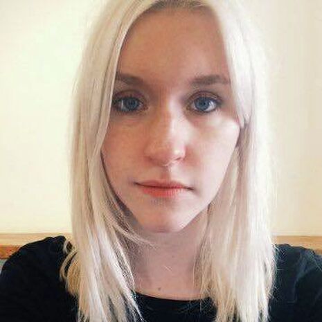
In conversation with Natalie Price
Varsity talks to poster and set designer Natalie Price to find out what it takes to create a masterpiece

Is there a process that you use when you are creating posters and/or sets?
It normally involves a lot of discussion with the director of the production. They tend to have some kind of concept or image in mind from the beginning and I aim to help them realise that. We’ll have a chat, I’ll do some rough sketches and then I’ll start work on the final design (usually a combination of hand drawn design and Photoshop). My experience of design has definitely been one of collaboration and dialogue: I’m very honest when I think something isn’t going to work, but as a designer you also need to be open to making constant alterations. That way it’s harmonious and you end up with something everyone’s happy with.
How do you find inspiration for each artwork?
This varies hugely depending on the design. Sometimes the director will have a very clear image in their head from which I take my cue (for example with Tribes); sometimes I have a very clear image in my head from the get-go based on what the director has told me about the play (for example with The Evil); sometimes I’ll spend hours creating Pinterest boards for inspiration and exploring different ideas (for example with Twelfth Night).
Which poster or set did you find the most difficult to create?
Probably the poster for Tribes, which is also one of my favourites. I reckon I made about fifty seemingly minor edits of that design, all of which I sent to Robbie Taylor Hunt, the director of the show (‘Is this better?’ ‘How about this?’). You can see the moment in our Facebook messages when it finally clicked. There were various issues to get around, one of which was that the photograph we used for the design took up the entire page, and it was really difficult to place the text on top of that (legibility is SO crucial when it comes to publicity design). In the end I layered about four different versions of the title, in different colours and at slightly different heights, on top of one another.
Which poster or set are you most proud of?
It’s a close call between Tribes and Twelfth Night, but Twelfth Night wins out because I was doing set and costumes as well as publicity. It was the first time I’d done production design, and though it was really daunting to begin with, it was also amazing to be responsible for the entire aesthetic.
Our production was set in the 1950s, and (probably because I’m a historian) I was really set on it feeling authentic: so the set was based on an amazing image I found of a building built in the ‘50s.
The poster was meant to look like a contemporary magazine cover, and I actually managed to find some affordable vintage items for costumes and props.
 News / Police to stop searching for stolen Fitzwilliam jade17 April 2024
 Interviews / ‘It fills you with a sense of awe’: the year abroad experience17 April 2024
 News / Night Climbers call for Cambridge to cut ties with Israel in new stunt15 April 2024
 Sport / Kabaddi: the ancient sport which has finally arrived in Cambridge17 April 2024
 Features / Cambridge’s first Foundation Year students: where are they now?7 April 2024


