Barbican Pop Art and Design: A bright but blighted exhibition
David Godwin takes a trip around the Barbican’s commendable exhibition

Pop Art Design attempts to ‘recognise the central role played by design’. At times, Pop Art Design presents brilliant works alongside excellent curatorial organisation. At other points however, the exhibition space seems confused and its process unclear which, regardless of whether you like Pop Art or not, is frustrating.
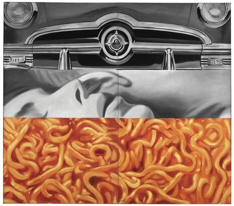
The exhibition’s thematic and chronological scope is commendable; viewing work that wasn’t limited to Warhol or Lichtenstein was refreshing. Admittedly, some of the pieces on display are fairly coma-inducing, but there are more hits than misses here. Warhol and Lichtenstein both feature in this exhibition but they do not drive it. There is a constant mix, demonstrated in James Rosenquist’s 'I love you with my Ford'. Separated into three horizontal sections together on a large canvas, the painting presents the front of a car, a close-up of someone’s face and a close-up of spaghetti hoops. At a distance, the metallic sheen of the car, bone structure of the face, and shadows of the spaghetti are rendered well. Their placement together is bizarre but each segment points to the wide interests this movement had: it wasn’t all comic or sourced from comics.
Kiki Kogelnik’s 'No title (Bomb)' is an unsettling and very memorable piece which sharply presents both 60s frivolity and engineered destruction. Indeed, as Warhol was working on his bright Marilyn series, American soldiers were being sent in their thousands to be killed in Vietnam. Its shape, an instantly recognisable bomb, is unusually coated with bright blue, yellow and red. These are cut through however with the base silver, the same silver as the metallic bomb casing. This piece presents the bright with the dark and the serious with the non-serious. It highlights an artistic movement interested in the bright flashes of its age; flashes which could have been spotlights in a fashionable club or exploding bombs on a battlefield.

There isn’t much wrong with the work on display but presentation choices are sometimes flawed. In a space that displays Warhol’s work and Coca-Cola bottle machines, viewers are kettled into a small space that makes viewing difficult. If presented more simply, it would have been more effective. Separating work thematically is logical and helps bring some much needed clarity to the environment. Incidentally, Francisco Uhlfelder’s Esso - LSD sculpture in the drug section was brilliant and continues the blend of the serious and non-serious once more. This clarity is distorted though, especially when the ambitious attempts to blend themes and chronology never fully materialise.
The exhibition’s booklet included a map with a key for ‘Pop Beginnings’, ‘Pop Icons’, ‘Pop Image’ and ‘From Pop to Postmodernism’. Trouble is though, I don’t want a map. Unless presentation style is necessary to the meaning of the work (and in this case it isn’t) my attention should be on the work only. Instead of focus, I was tripping over myself as I tried to establish my bearings. It doesn’t help that the text that introduces sections (which is never really that interesting anyway) was difficult to tie with the different sections they referred to.
The hushed voices of the visitors around me noticing that ‘there’s a map in the front’ reveal more problems than their low voices may initially present. In an artistic movement seemingly aware of its place and purpose of making art, the Barbican’s space lacked this sort of clarity. Pop Art Design therefore is reduced from being a ‘great’ exhibition to a ‘good’ one. Overlook those spacial difficulties and the work on display here is definitely worth the trip - both in distance to London and the occasional falling over.
Pop Art Design runs until 9th February 2014. For more information, click here News / Fitz students face ‘massive invasion of privacy’ over messy rooms23 April 2024
 News / Cambridge University disables comments following Passover post backlash 24 April 2024
 Comment / Gown vs town? Local investment plans must remember Cambridge is not just a university24 April 2024
 News / Climate activists smash windows of Cambridge Energy Institute22 April 2024
 News / Copycat don caught again19 April 2024


